
Responsive Web Design
What is Responsive Web Design?
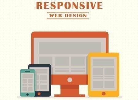
Responsive web design is the practice of creating websites that work seamlessly on all devices and screen sizes, whether mobile or desktop. It ensures an intuitive and gratifying experience for all users, adapting fluidly to changes in viewport width and other factors.
How Does Responsive Web Design Differ from Adaptive Design?
Responsive design reacts quickly and positively to changes, while adaptive design is modified for specific situations. Responsive design dynamically adapts to different browser and device viewports, while adaptive design uses preset factors. A combination of both offers an ideal solution for functional websites.
What Are the Key Components of Responsive Web Design?
Responsive web design is built on three main components: flexible layouts, media queries, and flexible media. These elements work together to ensure that websites adapt seamlessly to various devices and screen sizes.
Why Choose Cao-Tech for Responsive Web Design?
Cao-Tech uses the latest responsive web design codes to create websites that work across multiple platforms. We offer a cost-effective solution to make your site mobile-responsive without developing an app, ensuring high-speed delivery and 24/7 support.
How Does Responsive Web Design Benefit Small Businesses?
Responsive web design is crucial for small businesses as it enhances user experience and accessibility. It helps attract and retain customers by ensuring that websites are easily navigable on any device, which can lead to increased engagement and conversions.
What Makes Cao-Tech’s Approach Unique?
Cao-Tech’s unique approach lies in its entrepreneur-to-entrepreneur understanding and high-speed delivery. We focus on creating fully functional websites in just 3–5 days, backed by 24/7 technical support, ensuring that your business remains online and effective.